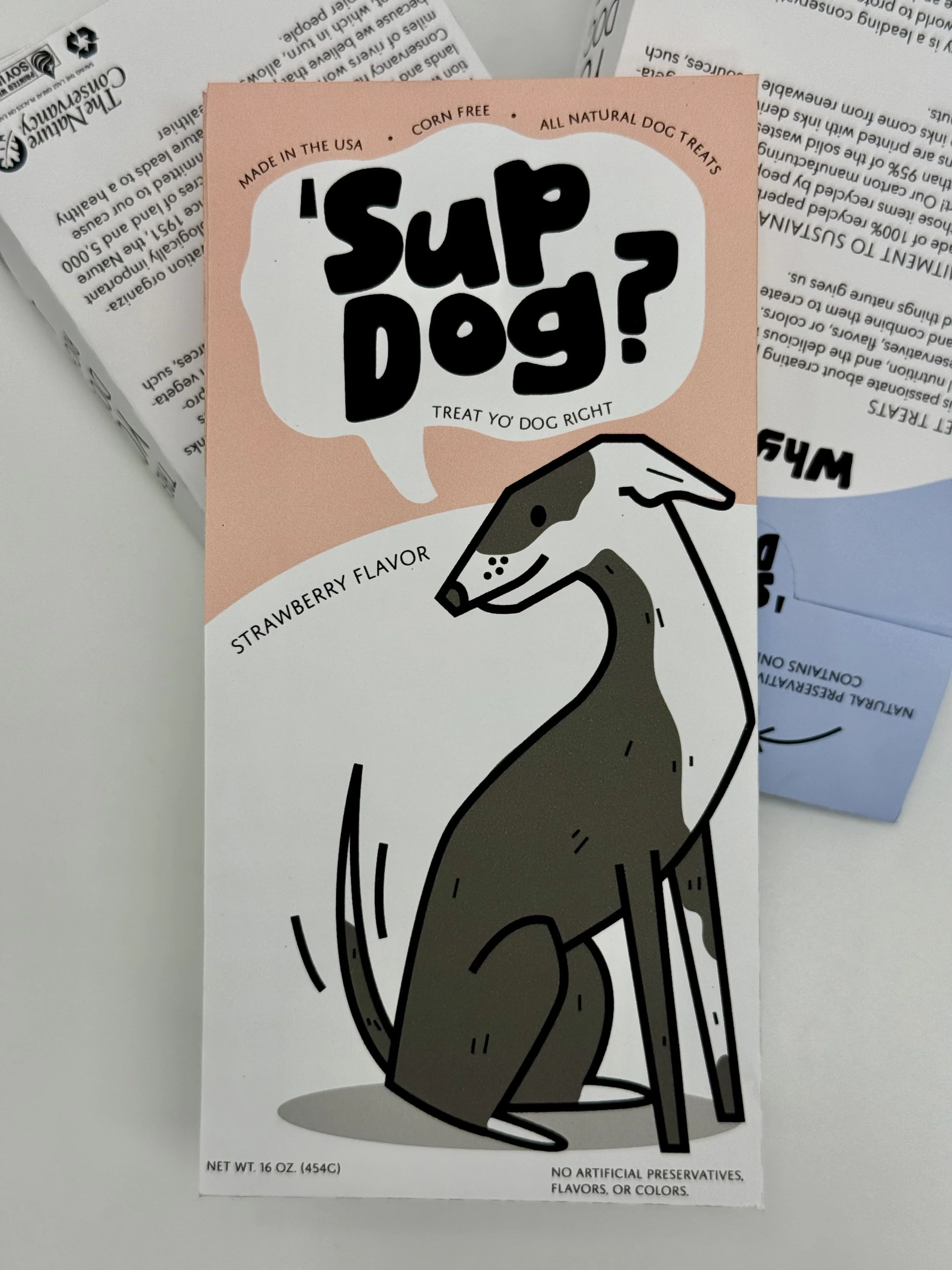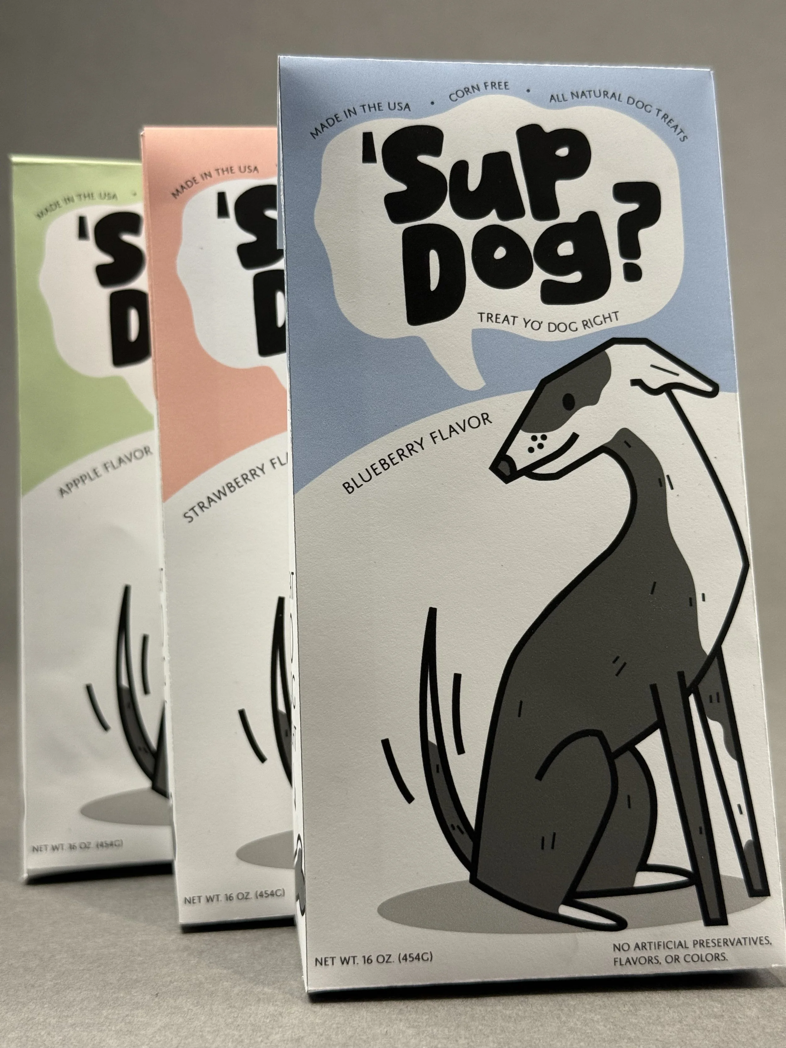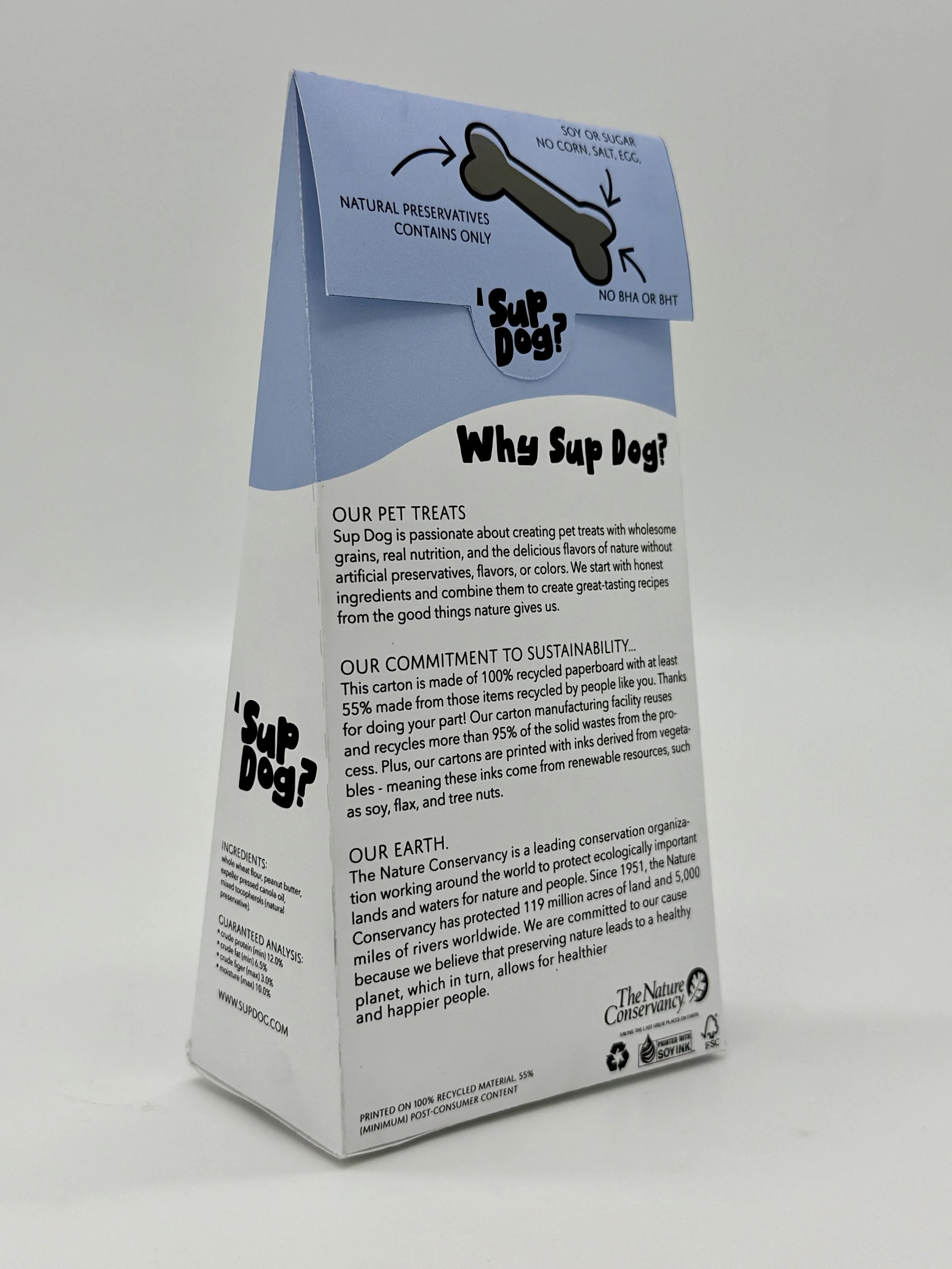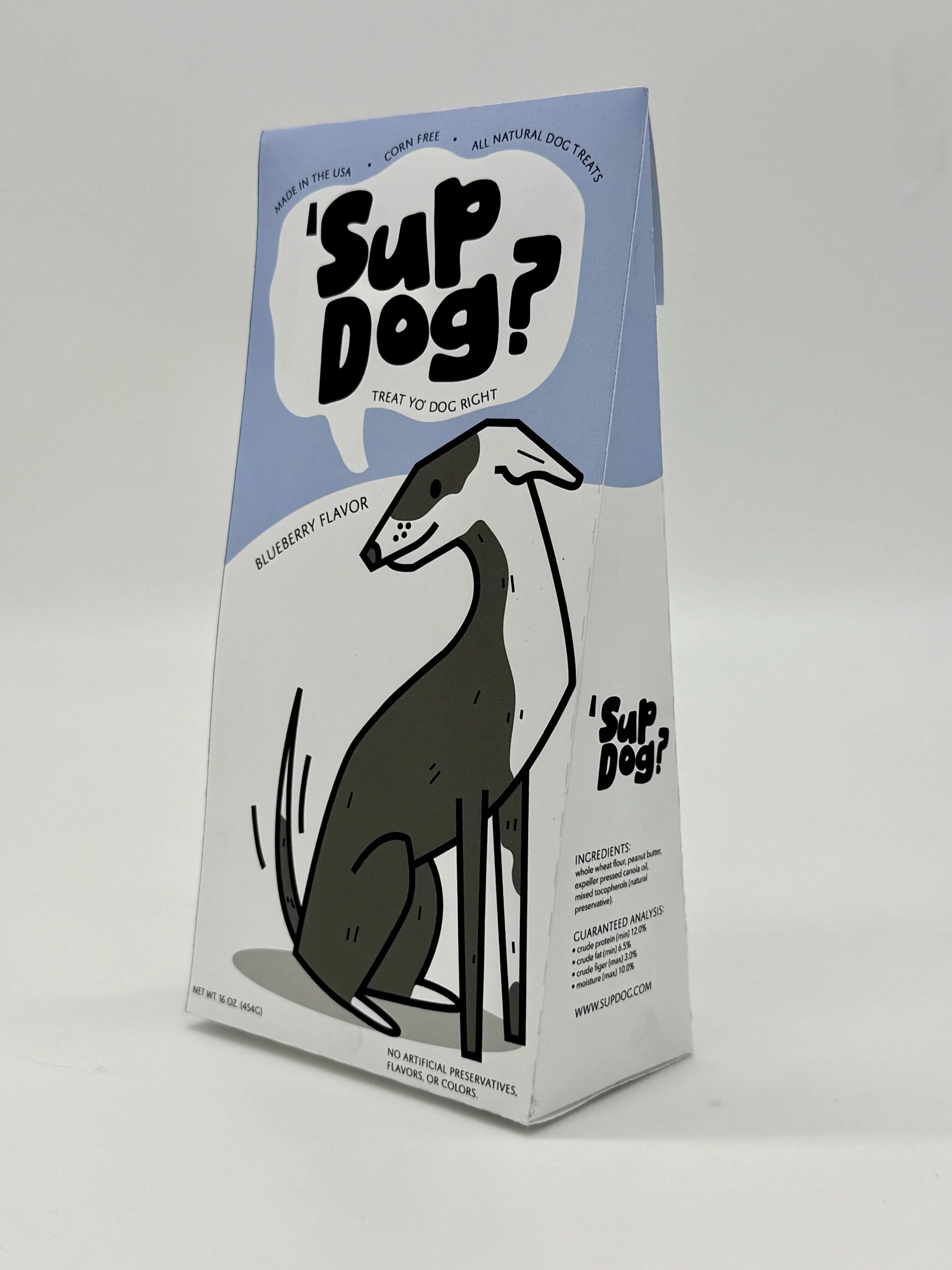
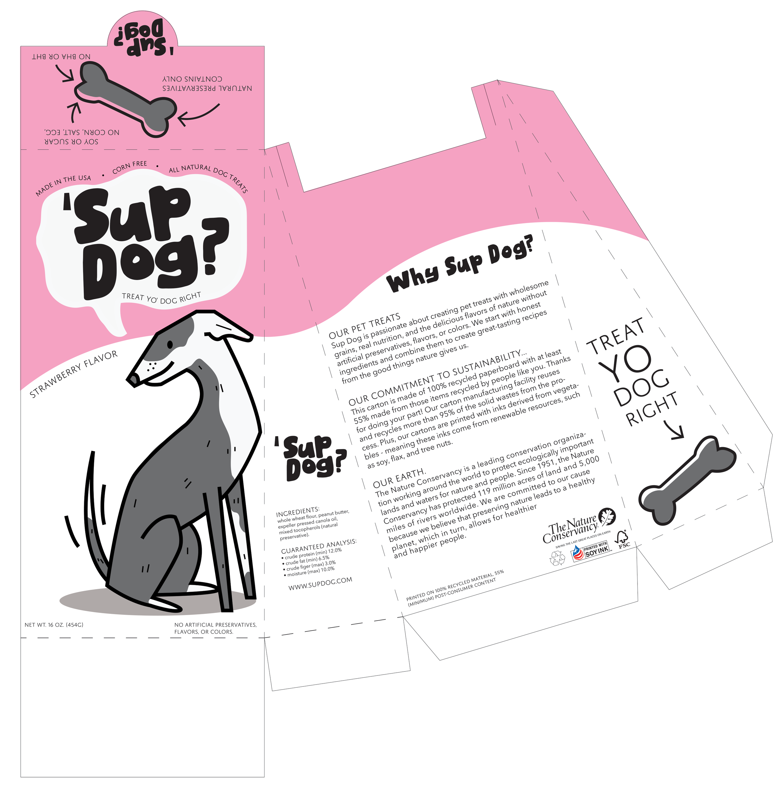
‘Sup Dog?
TREAT YO’ DOG RIGHT | PACKAGING
Traditional dog treats are either cheesy or clinical, forcing buyers to choose between looks and health. Your dog is part of your identity, your home, your daily rituals. The things you buy for them should reflect your taste and values not clash with them.
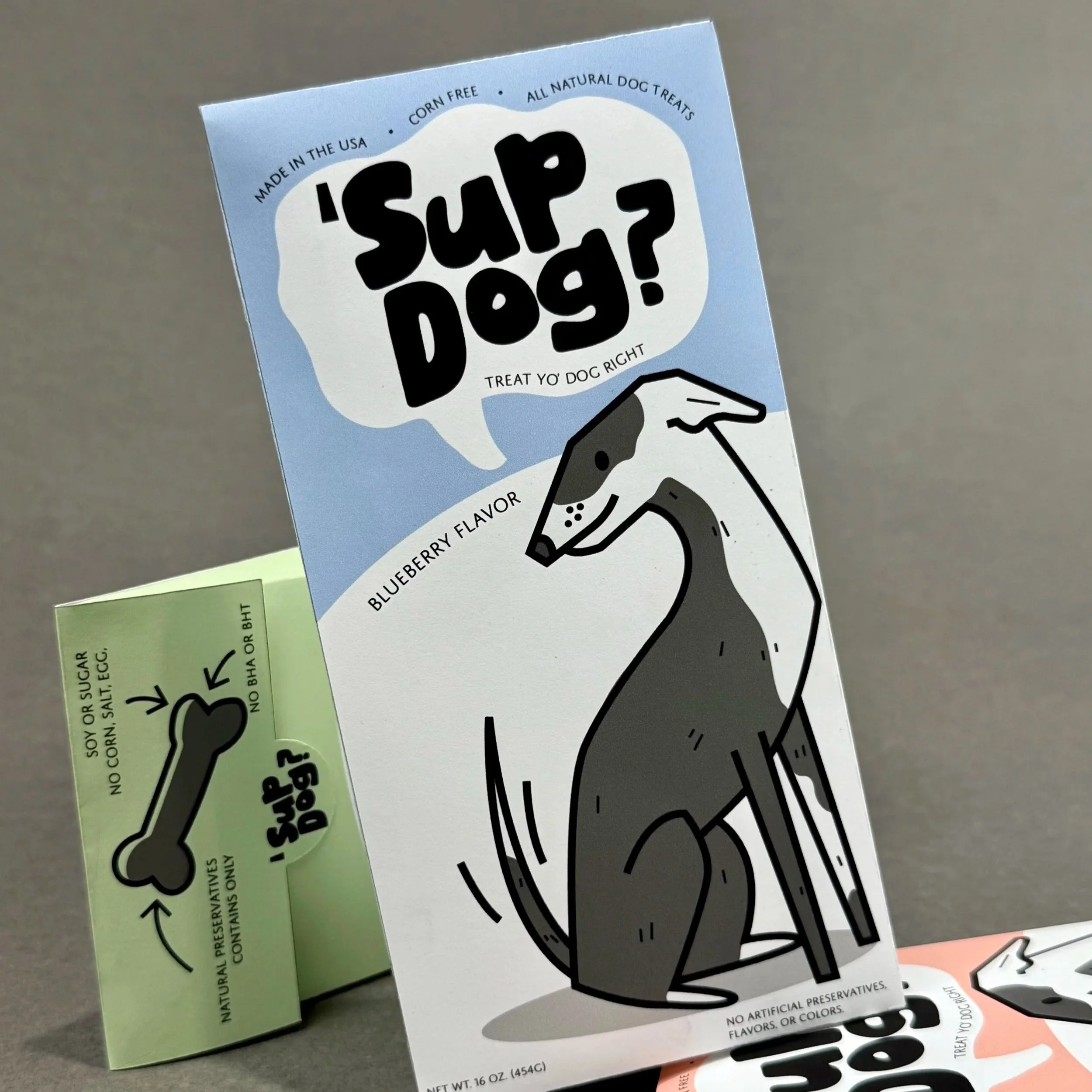
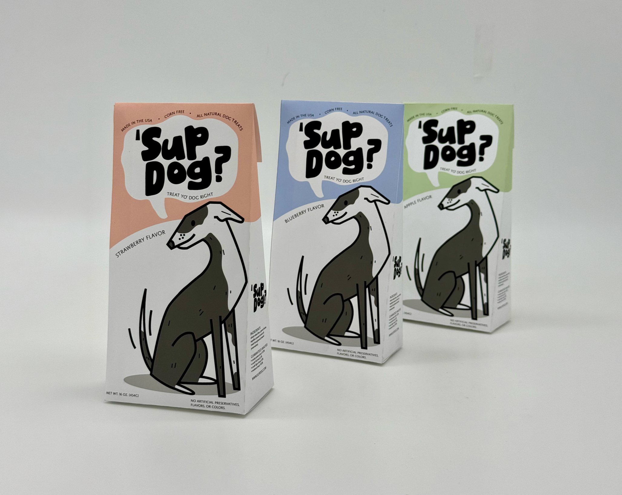
‘Sup Dog believes pet products can be as cool, curated, and expressive as anything else in your life. It can be hard to trust what’s actually inside while also finding something that fits your aesthetic, and ‘Sup Dog takes pride in elevating dog treats into something worth displaying and sharing. By utilizing illustrations and an interesting shape to stand out on the shelf among competitors, ‘Sup Dog makes a lasting impression.
The Problem
Development
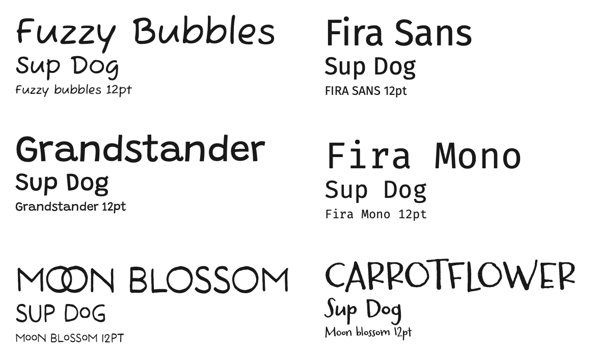
I knew right away that in order to stand out visually and create a product that feels cool, curated, and expressive I had to do some sort of illustration. So I began this project by sketching out a bunch of different dogs and trying to get an emotional feel for the types of dogs I would like to include on my packaging. I began with exploring different brushes in Procreate, using thinner lines for more detailed ones, and a chunkier charcoal brush for more expressive iterations. I also iterated with type choice and name ideas at this stage, wanting something that felt fun, expressive but still intentional and curated for the audience.
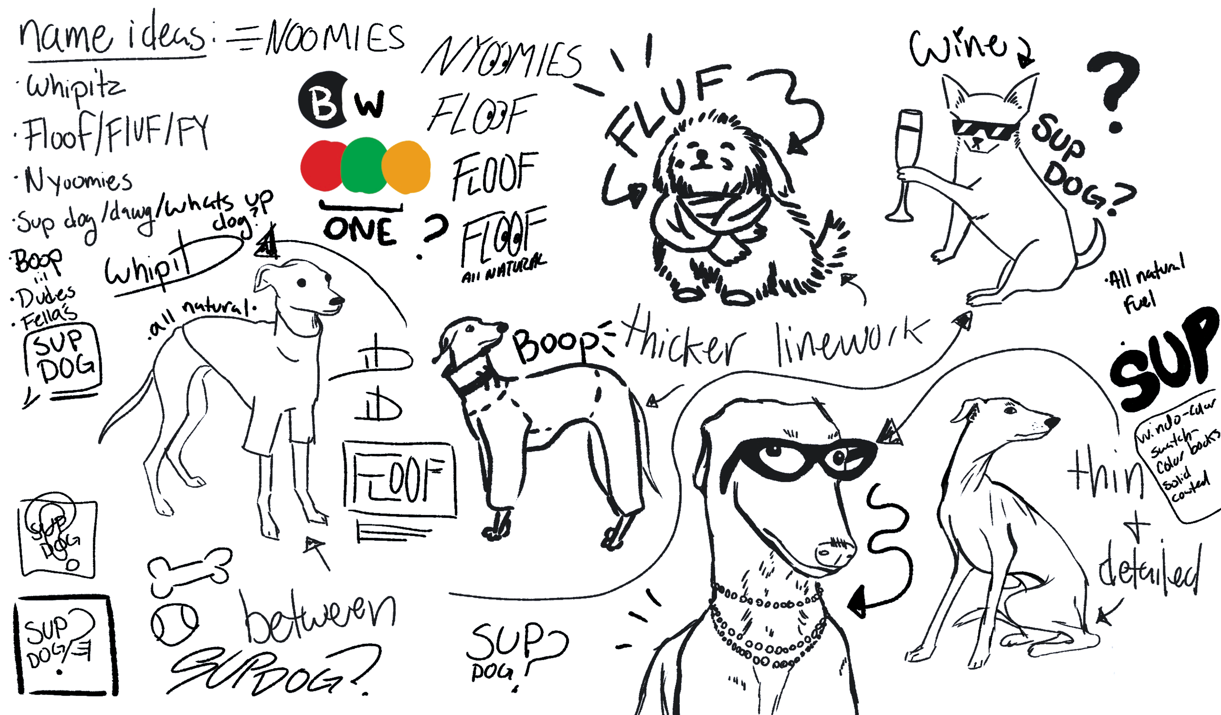
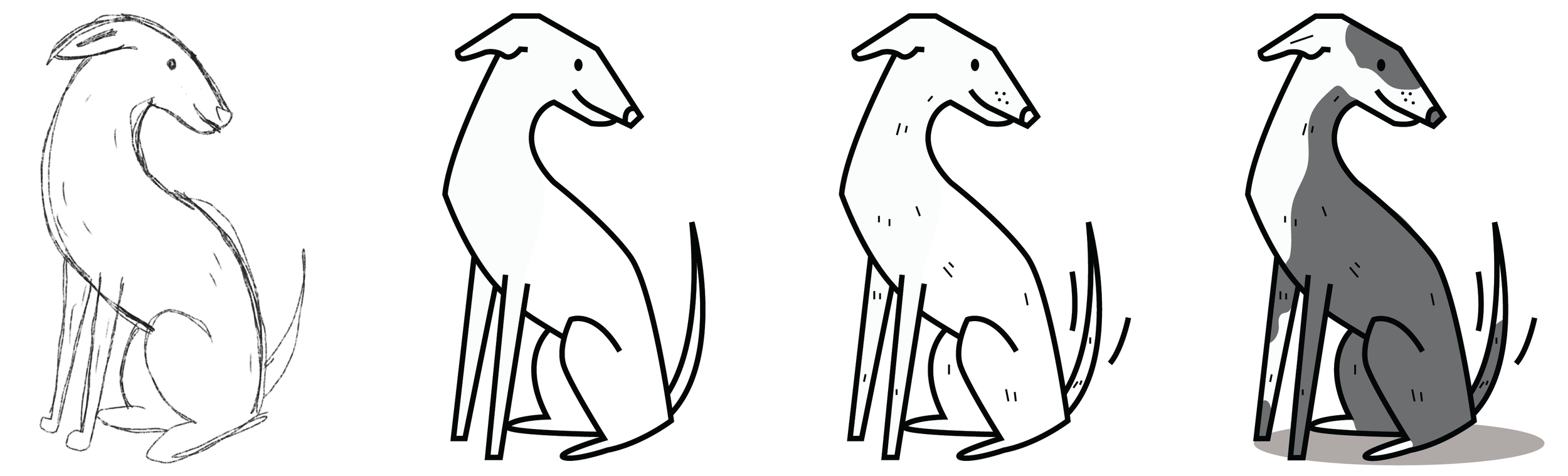
Combining multiple elements from my sketches that I felt were successful, I developed this style for the dogs.
packaging
The packaging for ‘Sup Dog is one of the most crucial parts of the project. I chose to break the monotony of regular dog treat packaging, which is full of rectangles, squares or pouches and instead chose a triangular design. It not only stands out, but it is also recognizable. Triangles introduce a feeling of motion and energy which reflects the playfulness of this brand well.
This choice was also rooted in sustainability as the brand already prides itself on healthy ingredients, creating a package that reflects that was crucial. This dieline was custom made for this project in order to generate the least amount of waste possible while also streamlining the folding and gluing process buy having only one side of the package join.