NOCTA
DATING APP | FIGMA | UI | UX
Love is not a one size fits all solution, and neither should the apps that help you find it. Nocta recognizes the many problems creatures face when looking for love. Whether it’s feeling isolated, unconsidered, or unwelcome, most dating apps fail to fill niche roles.
Nocta was developed to help Mothman find love through a platform that feels inclusive, welcoming, and dark enough not to hurt their eyes at night. Emphasis was placed on creating an intentional app by prioritizing self-expression, accessibility, and inclusivity, Nocta helps all users approach dating with curiosity and a dash of mystery.
The Challenge
RESEARCH
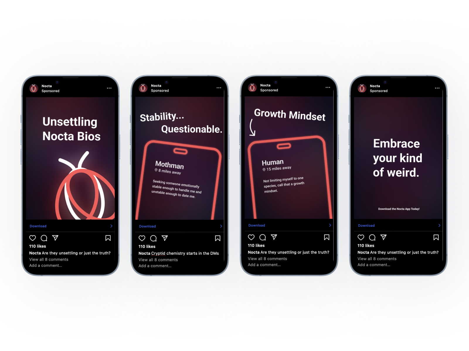
Other dating apps struggle with being truly connection focused, accessible and inclusive. These apps prioritize quick decision making and volume rather than connection, and have an over reliance on photos to help people make those decisions, making connection very surface level. Apps like Tinder, Hinge or Bumble are also restricted in who you can chat with.
Nocta instead focuses on genuine connections by foregoing profile pictures, restricted chat, and superficial swiping. In order to focus on this, the app has a major focus on blind dating, expansive profile customization and ways to connect intentionally as basic functions of the app.
DEVELOPMENT
Utilizing this research, I wanted to create iconography that felt timeless, unique and represented different parts of the brand. Specifically I wanted icons that felt friendly, welcoming, inclusive and were accessible.
When ideating on this, I started out with something closer to a moth and with a lot of realism. As I developed these I realized that they were not aligning with the brand mission or voice, so I started to distill the moth into more essential information. As the brand evolved, the icons all have overlapping elements and rounded edges, which reinforces the idea of connection and inclusivity, which aligns neatly with the app’s goals of fostering genuine connections.
This style was then applied to all the icons moving forward, including a set of twelve for interests, and four for the navigation bar.
Iterations of the Nocta logo, focusing on style, shapes and weights.
After finalizing the Nocta icon, the other iconography quickly fell into place.
Rough wireframes/sketches of screens to figure out user flow, assets needed and components I’d like to create.
User Flow of the app to identify any pain points in direct comparison to the final screen flow.
Potential Ad application focusing on Nocta’s brand
COLOR
Based on the legend of Mothman himself, the color red was intentionally chosen to represent not only his glowing eyes, but it is also the color most commonly associated with love or romance. The dark blue is meant to represent the dark of night. When overlaid with red, it creates purple.
When creating this app, I utilized a wide range of colors in order to have sufficient contrast between the background, type and surfaces. Utilizing Figma’s Token and Variable features, I assigned different color values to different variables such as surfaces and text to apply as styles for anything as needed. This helped keep everything consistent and I could change a color globally at any time. Additionally, all colors are adhering to WCAG standards.
All final screens from sign up to app usage.