Crows Coffee
DESIGN SYSTEM | BRANDING | ILLUSTRATION
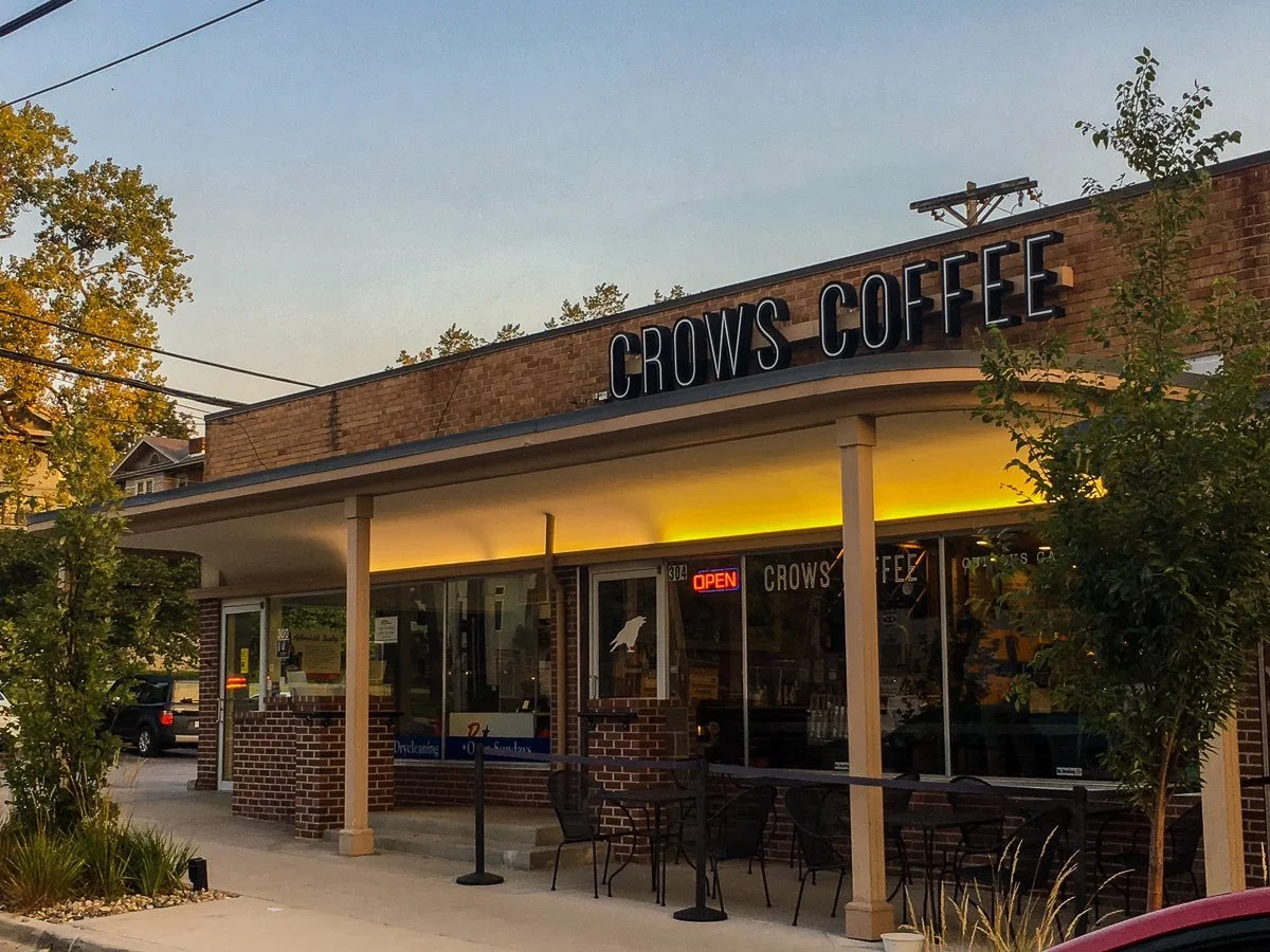
A lot of coffee shops in Kansas City have embraced a rustic and industrial aesthetic which is meant to highlight the artisanal and agricultural roots of the coffee they serve. To stand out against this over saturated market, this rebrand of Crows Coffee aims to create a neighborhood space that balances the high-end technical art of making coffee with a relaxed, approachable atmosphere.
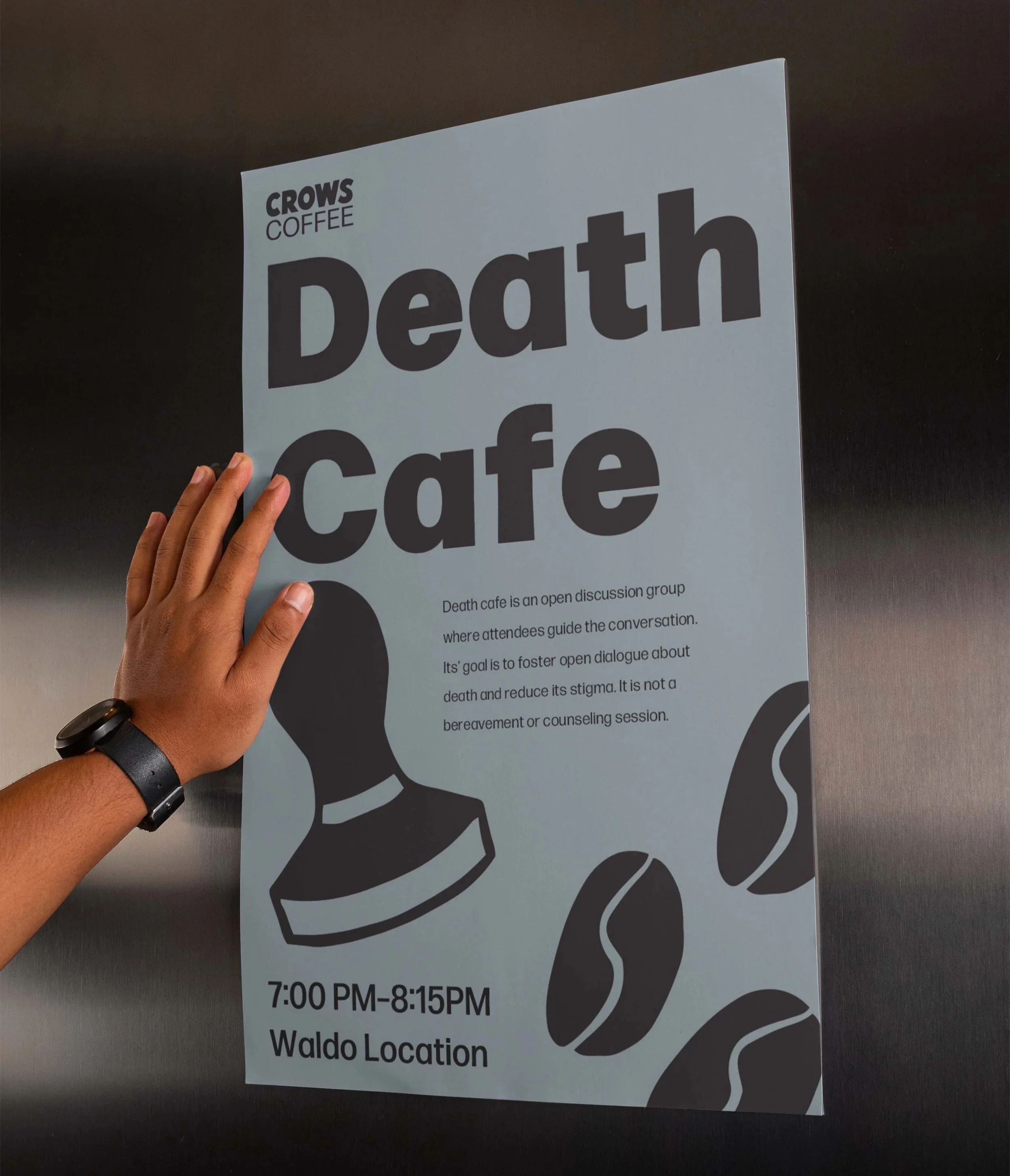
Crows are resourceful, social, and notoriously clever. They represent the spirit of the urban explorer. Whether you’re stopping in for a quick shot of espresso before work or lingering over a flaky, house-made croissant, Crows Coffee is your local roost a place to gather, think, and fuel your next big idea. Interested in the Brand Book? Look here.
The Challenge
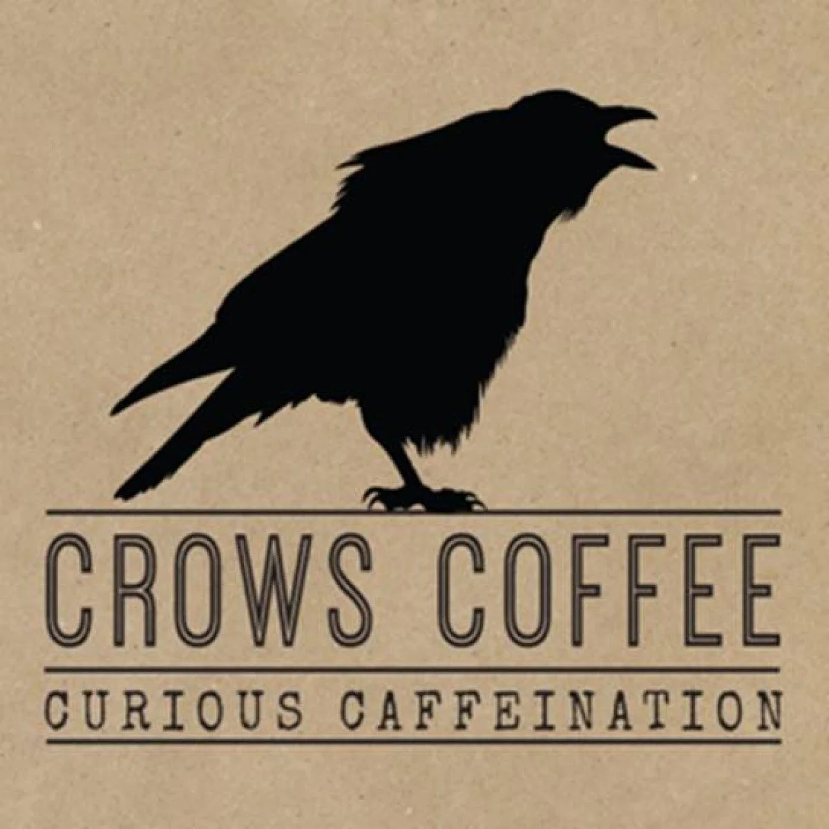
Crows Coffee initially embraced a third wave coffee brand, pairing their rustic interiors with a hyper realistic crow and matching typeface. This felt professional and looked nice when applied, but lacked true meaning and failed to reflect the customer base. Kansas City is full of coffee shops that roast their own beans, create blends and utilize similar visuals. In order to stand out while also aligning themselves with an ever-evolving industry of innovation and exploration, a rebrand is due.
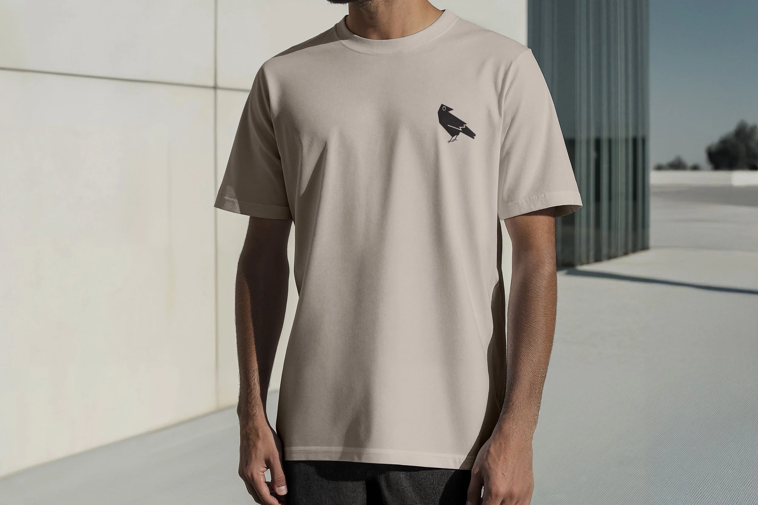
Crows are a social and routine oriented bird, they’re friendly birds who have the ability to recognize people’s faces. Choosing that as the mascot not only makes sense due to the name, but also because of what it represents and means. Utilizing this naturally playful and fun nature, I chose to go in a direction that hit all of the bases. I started off with sketches of crows in different styles in order to find what was working and what wouldn’t.
The rebrand
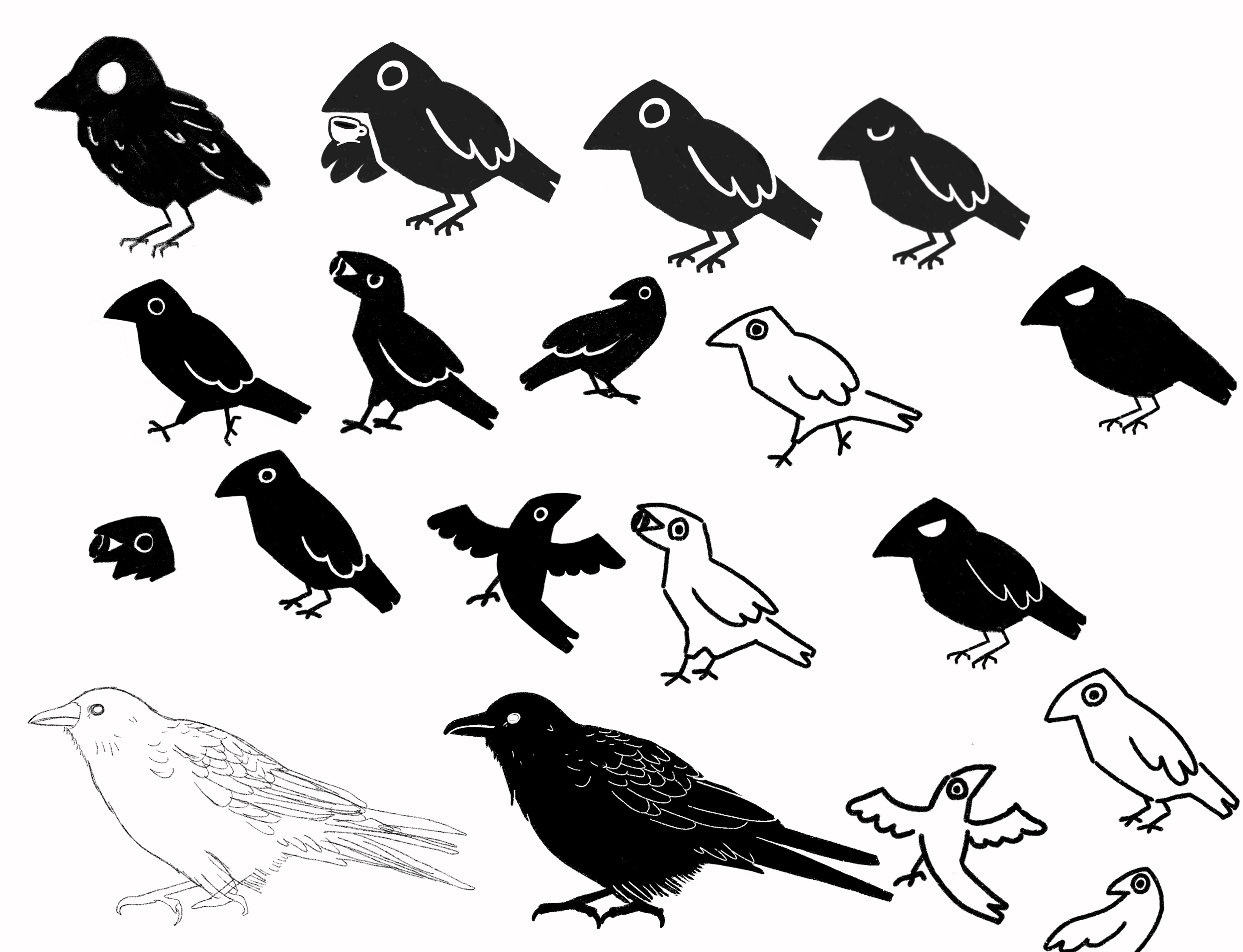
I started this project with many sketches exploring not only style, but also texture, mood and expressions with the crows. A lot of research was put into this portion of the project as I explored embodying different aspects of crows in an illustrative style. As I developed these images, I found a hard time identifying the bird. It was certainly bird-like, but lacked anything truly identifiable as a crow.
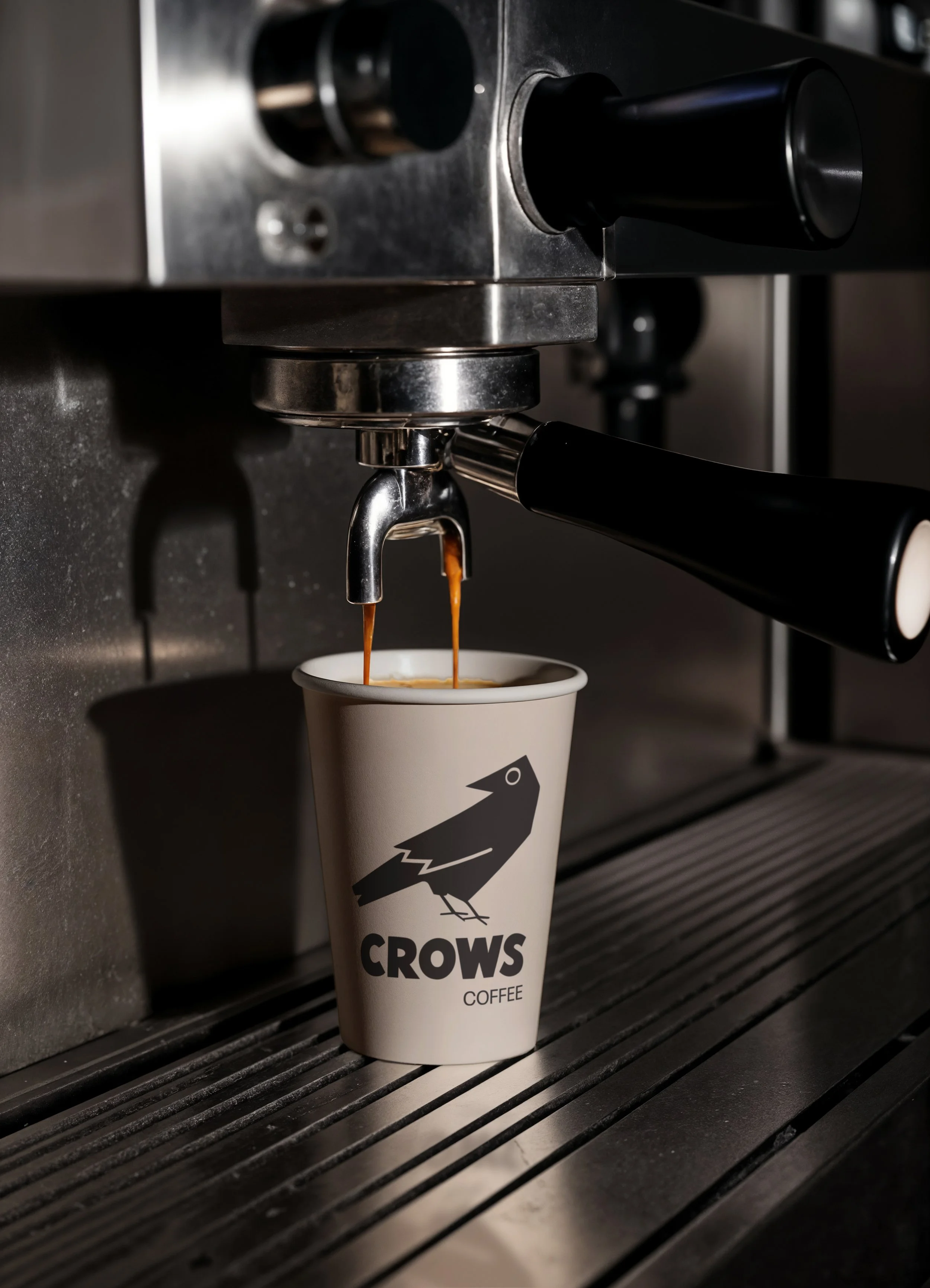
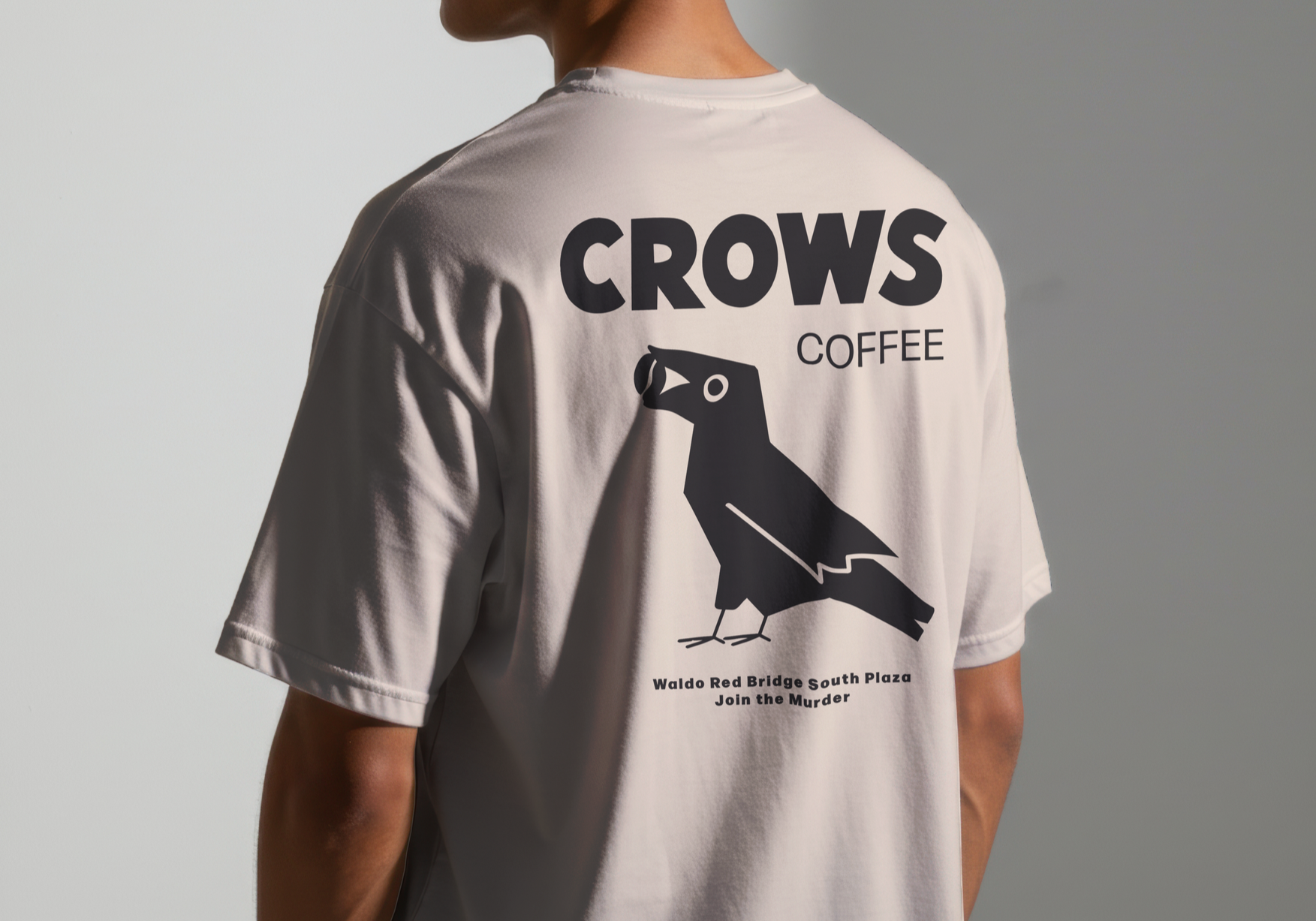
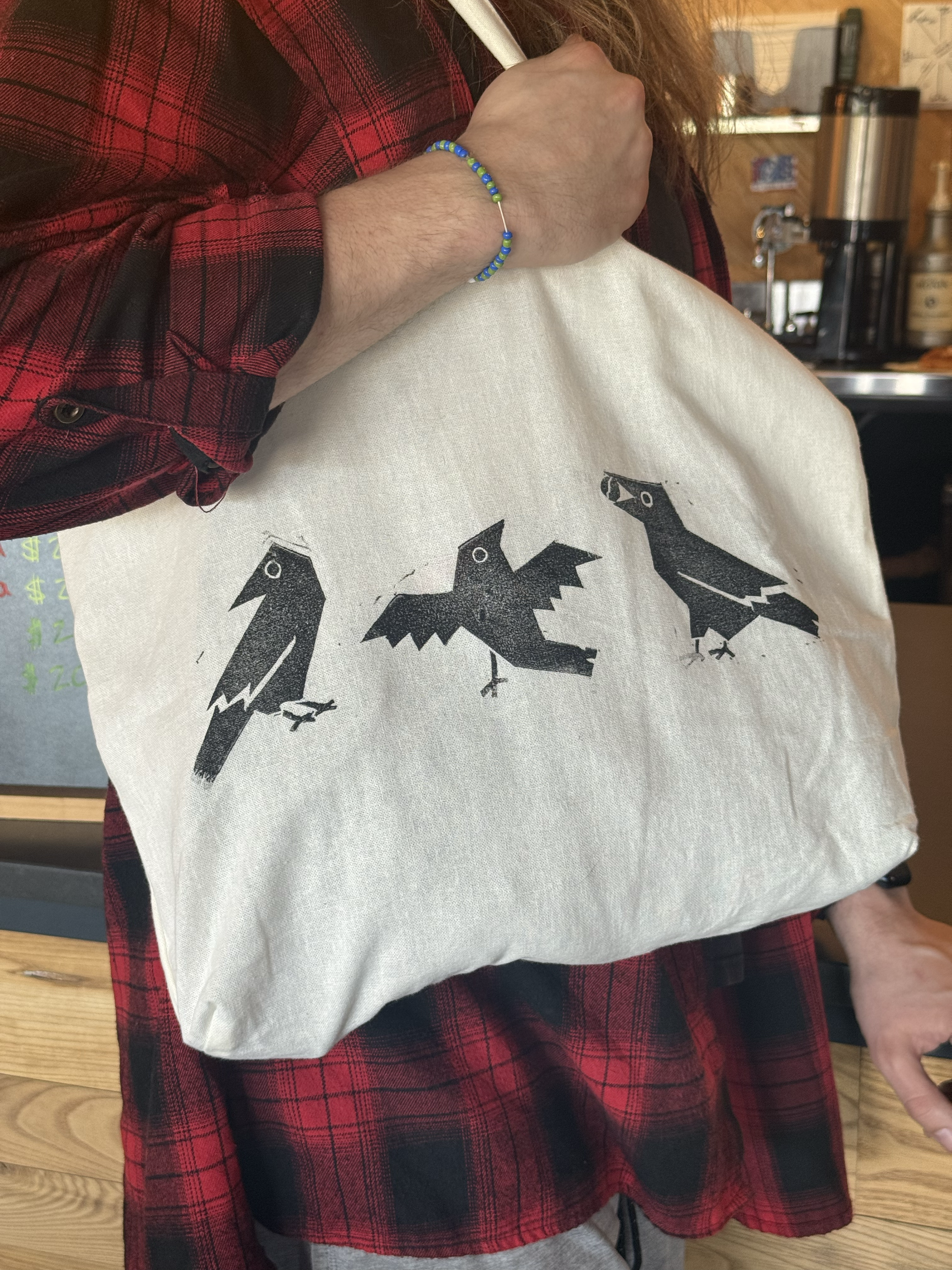
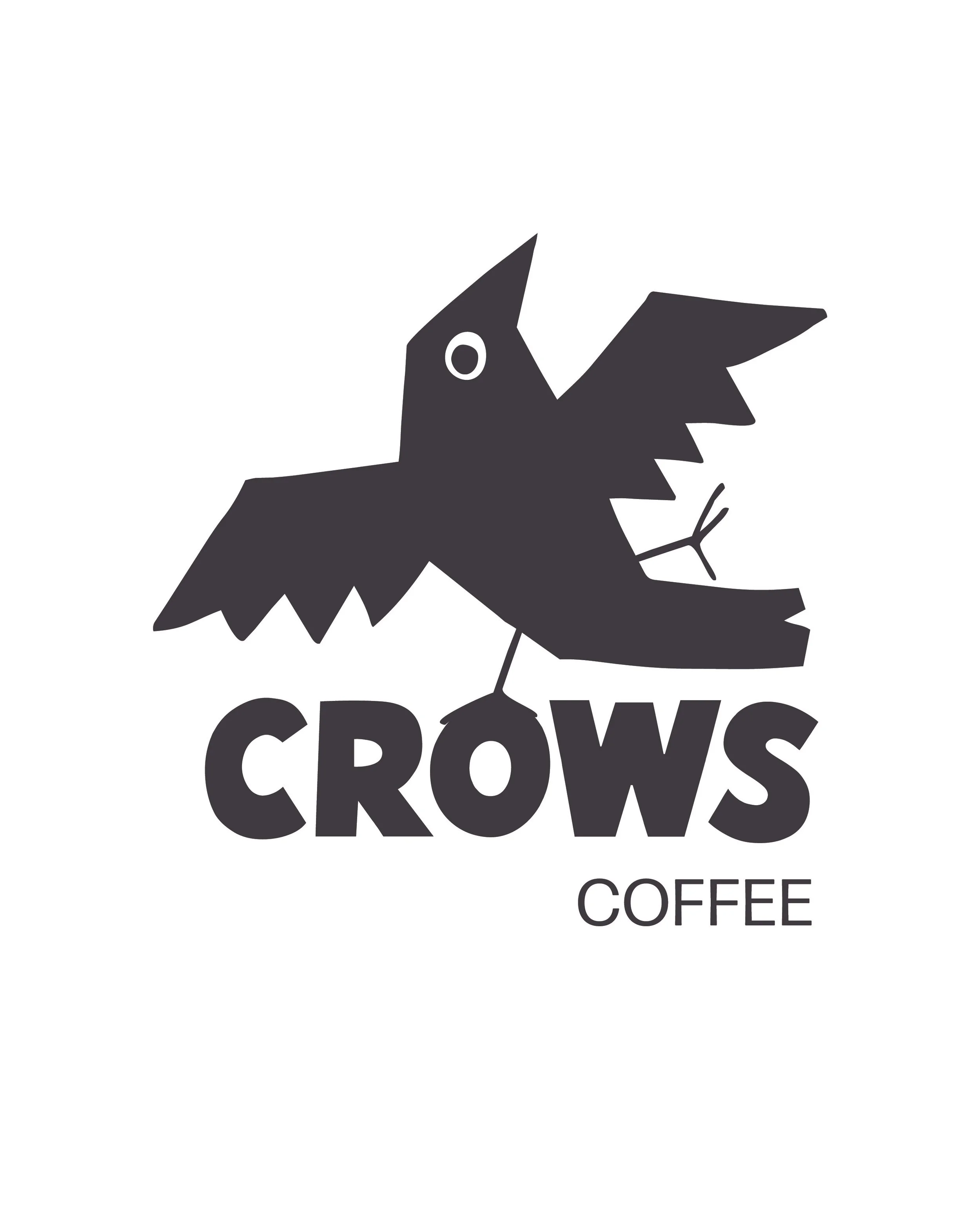
This caused me to do a deep dive on the difference between crows and ravens. Unlike ravens, crows are angular and naturally sleek, with less feathers and fluff. This fact helped me find a direction for the crow in a way that felt easily identifiable, but also geometric while remaining geometric, which also aligned with the overall goal of the brand and project. I expanded this system to three crows and five additional illustrative elements. This system would be easy to expand for any additional needs as well.
The process
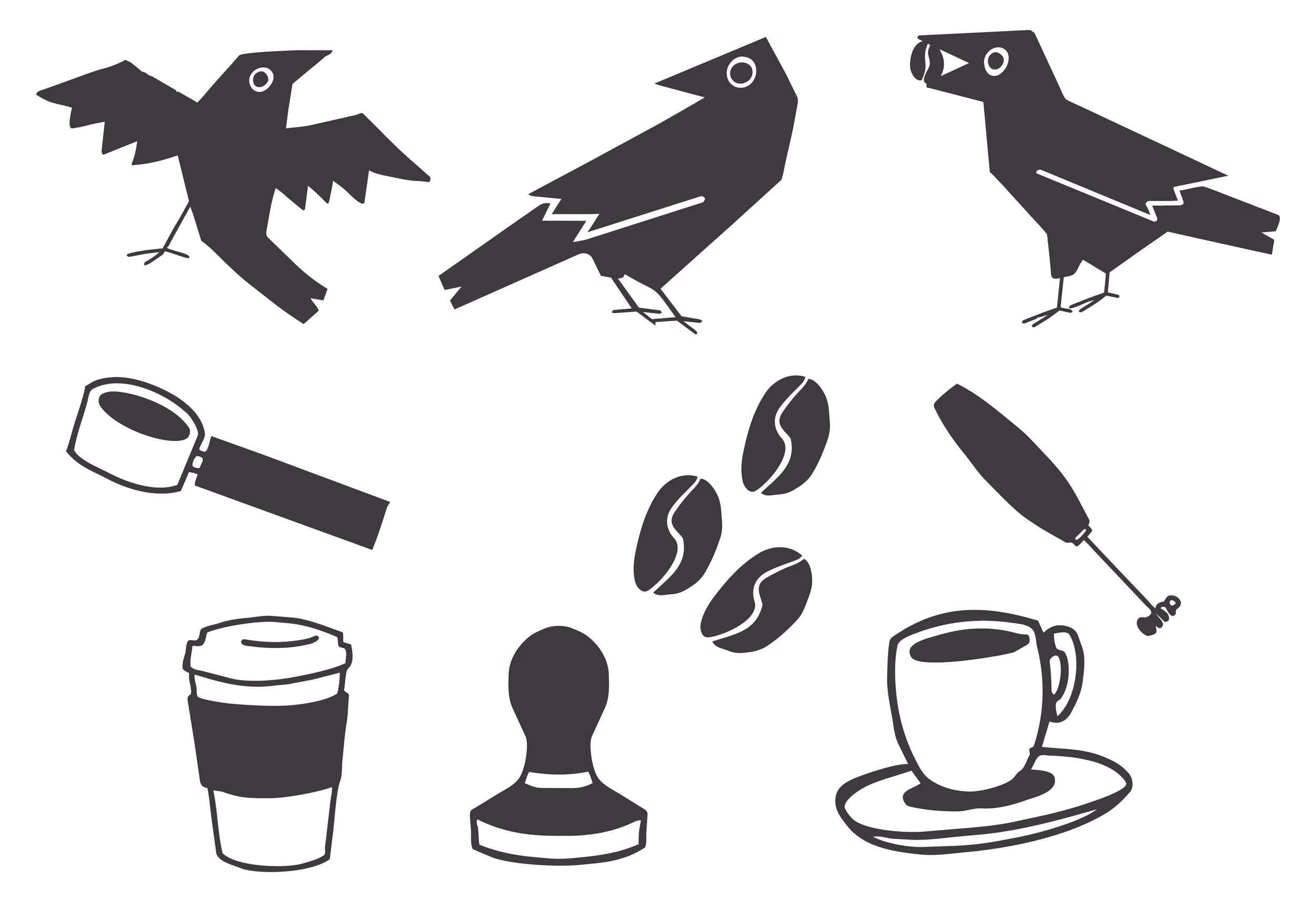
Final illustrations
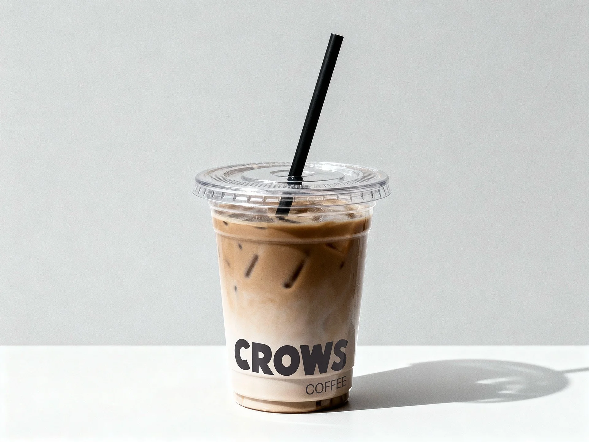
Final word mark