
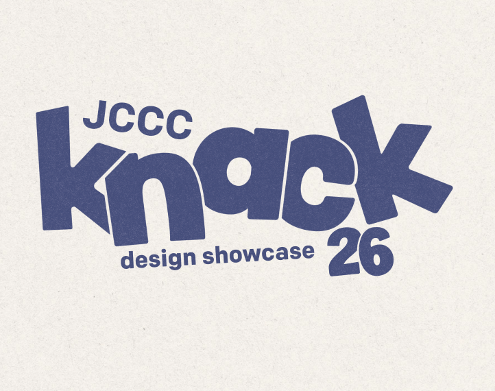
Knack
DESIGN SYSTEM | BRANDING
This project centered around encapsulating a whole year of graphic design students into a system that made everyone feel included, individual and put on display in a way that felt tasteful and current. This system would be utilized across multiple channels, social, printed material as well as way finding signage and web. The assets need to be flexible, and vast while connecting to how the student body feels, thus Knack was born. What’s your knack?
When developing the concept behind Knack, we wanted to develop a brand that felt emotional, short and punchy that would catch attention. Knack is meant to be fun and playful while remaining approachable, intentional and curated.
The Challenge
Any graphic design program teaches you not only how to use different programs, but also stacks skills on top of each other to make each designer unique as the skills each designer offers or excels at is different. To reflect this idea, I wanted to create a brand that had overlapping shapes that each person could remix to fit how they felt about themselves and their work. As the person who pitched the idea, I wanted to create something with an overlapping effect that reflected how I felt about graduating as a whole!
After my pitch was selected and I was named the pseudo Art Director, we immediately jumped into a group of five volunteers, Will Merckens, Jack Warner, Katie Thompson, Natalie Koeing and myself under the guidance of a few professors. We began with choosing different directions to execute the idea, and gradually worked at it and developed it until we reached a design system that truly reflected what we wanted to communicate.
The pitch
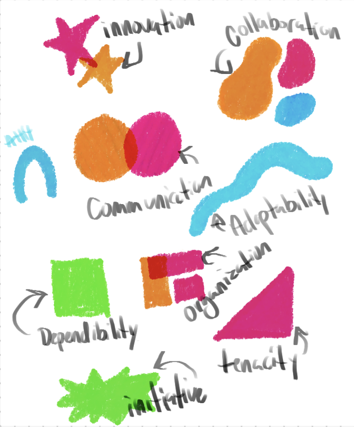
Round one and two of my iterations
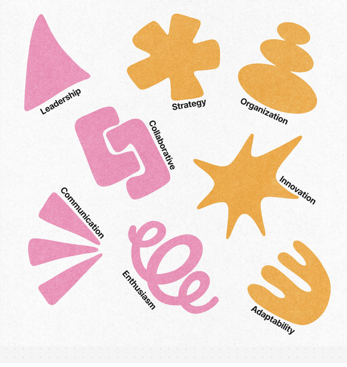
Round three, created by Katie
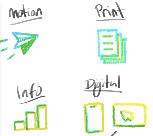
Where we ended up for shapes, left created by Katie and the right by Jack
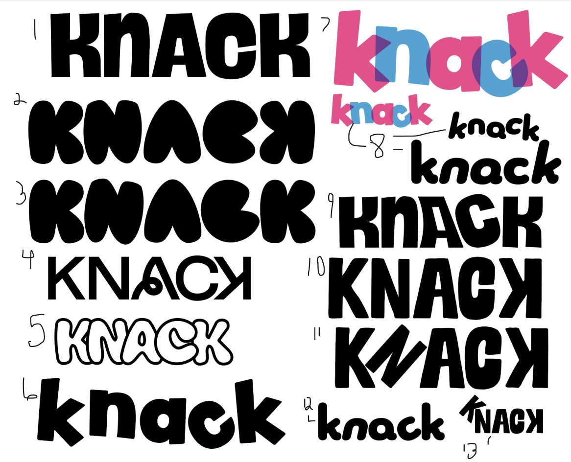
My iterations for Lockups
As the Art Director for this project I got to guide the vision of the project. Initially I started out with some iterations of shapes until we decided on a direction after many iterations and I delegated that task to two people in my group who excelled at illustration and texture. We began with ideas about different keywords graduates could assign to themselves that would have correlated shapes. We started with different styles until we reduced them down to something easily digestible, in two colors that would join together to overlap and have multitudes of combos for graduates to choose from to form their “knack”.
For the lockup, created entirely by me, I wanted to make something that reflected the brand, friendly, approachable and fun, and helped convey how the word Knack feels. So I chose a typeface that reflected those aspects and our shapes. The word knack is an emotional word that perfectly described our brand and I applied that when playing with different angles and overlapping bits in the word mark!